Forma Objects.
A quieter kind of presence. An identity for objects made to outlast the moment.
01 / The challenge
Find the idea
worth building.
In a homewares category full of warm neutrals and identical promises, Forma needed a point of view. The concept explores how a small collection of carefully made objects could feel distinctive without competing with the interiors they belong in.

02 / The solution
A clear direction.
A complete system.
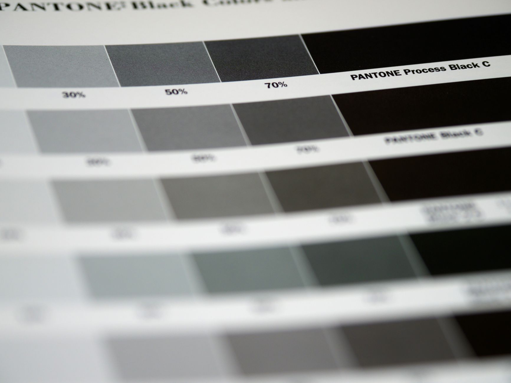
We built the identity around the space between things. An architectural wordmark, generous margins and a tightly edited monochrome palette let material and proportion lead. Packaging becomes a frame for the object, while a modular grid brings the same restraint to product stories and printed matter.

03 / The outcome
More than
a first impression.
The resulting concept is a complete identity system spanning packaging, editorial direction and a digital storefront prototype. It demonstrates how a limited palette can still carry a rich, recognisable personality. This is a self-initiated study; no commercial performance is claimed.
Have a similar ambition? Let’s talk ↗